Friday, February 25, 2011

Concert Poster Inspired Save the Dates


I love it when brides have a specific idea or theme in mind for their invitations. Lauren had these great engagement photos taken by photographer, Lindsay McDonald, inspired by the Bob Dylan album cover that you see in the picture. Music is a very important part of Lauren and John's life and will play a big part in their wedding so they knew that they wanted their save the dates and invitations to reflect that.

Lauren wanted to go with a vintage concert poster look for the save the dates. It was a simple 5x7 card, printed on both sides. She has a great fall color palette that is really enjoyed working with. We chose the aubergine envelopes to compliment. Her aunt will hand address the envelopes with gold ink.

Thursday, February 24, 2011

Food Diary of A Pregnant Lady - (The Last 24 Hours)

I am writing this as a reminder to myself 5 months from now, when I wonder how I could have possibly gained 40 lbs. during this pregnancy.

3:00 AM - I am awakened. I have to pee, someone is kicking me from the inside and I am starving. I walk downstairs in the dark to find a granola bar. Seems like the only sensible and convenient thing to eat in the middle of the night.

7:00 AM - Take 1 prenatal horse pill and 3 Ibuprofen (believe it or not, these are Dr. approved) for the persistent headaches.

7:15 AM - Breakfast. Egg on toast and a can of Coke. (Not so Dr. approved)

7:25 AM - Still hungry. Second breakfast. Egg on toast.

9:00 AM - Drive by the donut store. I resist the urge to pull in and get one. Remind myself that donuts were my downfall in the last pregnancy.

9:20 AM - Eat a Cadbury Egg that I picked up in the gas station on a whim a few days ago. WHAT?! I don't even like those things. I never have! Not even as a kid! But I wonder why because they are quite tasty.

12:30 PM - Lunch date with a friend. I order the burrito/taco combo plate with a side of beans and rice, another coke. I practice some restraint and only eat 85% of it.

1:30 PM - I tell myself that as a Pregnant, I am no longer allowed to eat Mexican. I feel horrible.

3:00 PM - Handful of mini chocolate chip cookies.

5:00 PM - First dinner. Half of an avacado and the remainder of Cam's grilled cheese.

5:15 PM - Two spoonfuls of Cam's superman ice cream.

5:45 PM - Remove Cam from his timeout chair and crack a mini bottle of red wine. That equals one glass, so all of you pregnancy health nuts out there, don't get all crazy on me. My Dr. doesn't mind the occasional glass.

6:00 PM - After a day of stuffing my face with grotesque Mexican food, I decide that chicken salad would be our best option for dinner. Start prepping that. Crack another mini bottle of wine. (Shhh. Not so Dr. or husband approved).

7:00 PM - Feel slightly better about myself. Perhaps due to the light meal and wine.

8:00 PM - The vanilla ice cream is calling my name. Have a bowl of that with chocolate sauce.

9:00 PM - Thoroughly disgusted with myself, call it a night and vow to eat better tomorrow.


Wednesday, February 23, 2011

French Letterpress Invitations


This is one of my favorite wedding suites to date. Jackie is have a destination wedding of sorts in Cannes, France. Her inspiration was sort of an Art Nouveau style with ornate, French details. Her original colors were plum and apple green, but with a wedding by the sea, we decided that the soft aqua was much more appropriate, and I am so glad she did! The subtleness of the aqua, paired with the contrast of black makes such an impact.

For the graphics, I chose a swirl pattern that reminded me of the ocean waves and added the speckles for interest and an unexpected detail. You could even say they look like grains of sand. :) Fot the French details, I used a lacy looking boarder and used it sparingly within the booklet and on the thank you card. We also incorporated a bit of French with the English translation on the pieces for fun and personalization.

The bride really wanted to have letterpress, but had to work within a budget. So we letterpressed the invitation and booklet only, and offset printed the remaining pieces.

With guests coming from all over the world, she wanted to include information about travel options, hotels and things to do while in Cannes. The best way to combine all of this information was in a booklet. It even has space in the back to write notes. This way, guests can carry it with them. We eliminated the traditional response card to save, and she is having her guests email her with their RSVP. The other pieces included a weekend timeline and an invitation to the rehearsal dinner.

Everything was packaged beautifully with a simple cord wrap in variegated colors of blues, greens and aqua.

Tuesday, February 22, 2011

Valentine's Day Card


My friend and wedding industry pro, Lindsey Nartker asked me to help her with her rebranding project.

Lindsey, of the formally named, Lindsey Nartker Designs, has revamped her business name and added more services to her event planning business. Now named Flourish Event Design, Lindsey and her team not only offer event planning, but floral and decor design as well.

She thought it would be fun to send a Valentine's Day card out letting everyone know about her big changes. She wrote the cute poem and I designed the card for her.

Check out her website here, and see her blog for the latest happenings at Flourish Event Design.

Monday, February 21, 2011

Katie's Camp Invitations - The Wedding

Remember these?
Well here is the wedding that the invitations were created for, as shot by the amazing, Kelty from Steep Street Photography.

Earlier this month Jen from Green Wedding Shoes featured this wedding. Here are some more images that you didn't see. Read more about the makings of the wedding from the bride herself over at Green Wedding Shoes. To see even more eye candy, check out the Steep Street blog.

Katie's Aunt made a quilt as a gift for the bride and the groom with the entire timeline I created for them stitched into it! Amazing!


I love how lush and green everything is. What a lovely setting for an outdoor wedding.


Monday, January 17, 2011

Christmas Card 2010


Every year I do a Christmas card that goes out to past clients and all the great people I get to work with throughout the wedding season. I try to do a different layout and inject some humor into it so that it is not your typical Christmas card.

This year's topic was, Things I May or May Not Like About Christmas. I went all out with envelope liners (which apparently rubbed off on the cotton paper :/. I will not do that again), vintage stamps and hand done calligraphy.

The stamps came from The Paper Nickel. Holly has a huge selection of stamps and takes all of the work out of it for you. You can tell her your colors or theme and she will hand select stamps that match your project.

The calligraphy was done by Nicole Black at The Left Handed Calligrapher.

Tuesday, January 11, 2011

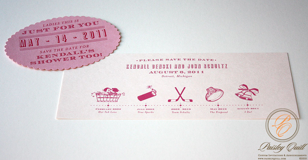
Kendall's Timeline Save the Date


For a more fun and casual approach to save the dates, we opted for a timeline of events leading up to Kendall and John's engagement. She came up with cute sayings for the important events in their relationship.


I also did another save the date, within the save the date, which I had never done before! Many of Kendall's girlfriends are getting married this year, and she wanted to make sure they would be able to attend her shower as well. She included a save the date to the bridal shower along with the regular save the date, to a select number of friends and family.

Thursday, December 16, 2010

Napa Valley - Save the Dates

Brooke's wedding is being held at the Beaulieu Garden in Napa Valley. A gorgeous setting for an outdoor wedding. She wanted her save the dates to have a rustic, but soft, romantic and a European feel. Many of Brooke's guests are coming from all over the country so she also liked the idea of doing a vintage travel theme. Instead of the typical grapes and vines that you often see with a wine country wedding, Brooke is using olive branches throughout her decor, and wanted to incorporate them into her save the dates as well.

She chose the super soft and luxurious cotton paper.

We also did custom olive branch stamps, with translucent envelopes and fun wrap around mailing labels.

Tuesday, December 7, 2010

Colorado - Save the Date, Represent Your State


Hillary really liked my Santa Fe save the dates and wanted to recreate something similar for her Colorado wedding. Complete with mountain scenery and columbines. (Colorado's state flower).


Her wedding is taking place on a ranch in Telluride. She wanted her save the dates to have that rustic feel. We went with craft paper and the ever popular vintage map mailing labels.

Monday, November 29, 2010

Spanish Style Wedding Accessories

Andrea's beautiful wedding accessories to compliment her Spanish Style invitations.

Her color palette is full of rich wines, golds and plums, so for her accessories, we went with a deep plum with gold foil and thermography details.

The menus were die-cut to fit chargers, and are gold foiled, using the same ornate, iron work pattern from her invitations.


Wedding programs were printed on soft cotton paper, then rolled and tied together with gold ribbon.


The weekend itinerary booklet was printed with gold thermography and a timeline of events for the wedding day.

Monday, November 8, 2010

My Momma

Isn't she pretty. One of my favorite pictures.

Friday, October 29, 2010

When I Had Skillz


To finish up my week of looking back on my college days. I thought I would share some more of my artwork. These were assignments that I had to do for Drawing 101. It was a class where you touched on all different subjects for drawing, such a collage, still life, and yes, nudes. My first experience with nude drawing was insane! Lets just say, body glitter, a piercing where it shouldn't have been and something else that I do not think it would be appropriate for me to elaborate here on this forum! Lucky for you, I will not be posting any of my sketches from that session!

I wish my hand drawing skills were what they used to be. That is something I have to practice at. I do not have the natural talent that some do, but I thought it was a good effort. :) The majority of my work is done on a computer, therefore, my hand drawing skills have really diminished. Even my handwriting is terrible. In school they really encourage you you to sketch out your ideas first and then bring them to life with your design software so that you don't get out of practice of hand drawing. I used to do this, but I admit, I have gotten very lazy and skip that step and go right to the computer. Perhaps that will be something I will work on for 2011...

For this project we had to make a collage of magazine clippings first and then draw it.

Wednesday, October 27, 2010

Making Lists

I have been restless this week. I am not sure why. Most likely because I have lots of ideas and thoughts running around in my head. I can't sleep when that happens. I have woke up at 2:30 am every night this week, lets hope not again tonight. Monday, I couldn't fall back asleep. I got up, went downstairs, sat at the kitchen table, and by the light of my Macbook I wrote everything down.

I am a list maker. Always have been. There is something about the physicality of writing out a list by hand, and then crossing off each item when it is complete. I have all the technology I need to just type up a list and leave it on my desktop or put it on my calendar in my iphone, but I would much rather scrawl it out on a post-it and stick it on the dashboard of my car so I won't forget. Ask my husband. It drives him nuts. Right now I have 3 new invitation ideas on a post-it stuck to the fridge. I have scraps of paper in my purse with very important things written on them. To him it looks like clutter, but it is my way of thinking out loud and not forgetting.

I like the look of a list. It gives a nice order to things. If I am freaking out because I have a million little projects to get done by a certain date, and even though it is all recorded in ical, if I make a list, it will get done. I especially like to cross off each item when it's completed. I look forward to it because it gives me that sense of accomplishment. It's like when you go to Costco and you buy a 3 pack of Soft Scrub. You put them on the shelf in your laundry room, and one-by-one, as you use a bottle up, you go down for the next. Each one feels like you are getting closer to the end, and when you use that last bottle up 6 months later, you feel that you have accomplished something, AND, of course, you probably saved $6.00 for buying in bulk rather than buying from Kroger.

So, as I was up on Monday at 2:30 writing the last blog post, it got me thinking about all of the other jobs I had in college. 10 to be exact. I began listing them in my head, but then that got to be distracting, so I wrote them out so I wouldn't have to keep track of them in my head anymore. So, if you are curious...

Jobs That I have Held in My Non-Professional Career
(In no particular order)

1. Seasonal hire at Hudson's Department Store - Jewlery Counter
Pros: Discounts on merch.
Cons: Standing on your feet for 4-6 hrs during holiday season.

2.Bagel Haul Deli (one of the best Jewish delis EVER)
Pros: Free bagels and new dills!
Cons: Starting at 6am after being out late the night before.

3. College Pro Painters (yes, I painted houses)
Pros: Got a killer tan
Cons: I think I was paid $6/hr for climbing to the top of a 30 ft., fully extended ladder.

4. Parking lot attendant
Pros: Occasionally my friends would drive through and bring me beer disguised in slurpee cups. Oh, and ample time to do the State News crossword.
Cons: Working until 12 am on a Saturday night, well aware that a sweet dance party was just getting started at my apartment without me.

5. Student Assistant for the Department of Management and Budget
Pros: Got to drive the Director's state vehicle (a Jeep Cherokee, I am sure you are all wondering) to get gassed up and washed. Oh, and 10-ish years ago, it paid $12/hr. I wonder if it still pays that well?
Cons: Had to do such mind numbing tasks such as pull the staples out of 500 copies, remove the page that someone f'ed up, put the correct page in, staple and repeat.

6. Abercrombie and Fitch (for about 2 minutes)
Pros: None.
Cons: Worked with a bunch of DBs, choked on cologne and spent all of my earnings on their clothes. I was REQUIRED to wear 3 A&F items at a time! Ridiculous.

7. Tasty Twist (the best ice cream establishment in East Lansing)
Pros: Worked with a bunch of my friends. Free ice cream
Cons: Strictly a cash biz. Had to make change in my head, and I am no math star. Hence, why I am in a creative field.

8. Waitress at a local bar/restaurant.
Pros: Lots of dolla, dolla bills on hand.
Cons: Working late, while my friends went out. Carrying those giant trays on your shoulder.

9. Babysitter for 3 year old triplets with unfit parents.
Pros: Beautiful children and if I could have, I would of adopted them all.
Cons: Where do I start. I quit and called Protective Services. Enough said.

10. Designer for the State News
Pros: I got to do what I love
Cons: I can't think of any

Tuesday, October 26, 2010

COLLEGE


College rockstars. I think we've still got it!

Two weeks ago, my two best girlfriends and our husbands made the trek back to our old stomping grounds for homecoming. The place where a cab ride home was only $2.00, Jager Bombs were the new thing and running the dance floor was a must. Our only worries in life were making it to our classes and what we were going to wear out that evening. Yes people, I am talking about Michigan State University, home of the current undefeated Spartan football team, and where I spent some of the best times of my life. Every year, we try and make it back, and relive the glory days, and that is why we do it only once a year! It is much too hard to recover as you get older.

As we walked down Grand River, we passed the relatively new State News building. When I was there is was located on the third floor of the Student Services Building. Now, they have a sweet space on the main drag. As a junior and senior, I had a kick ass job as a designer for the paper. I LOVED it. Out of all the college jobs I had, this was by far the most gratifying. I went there every night for four hours and made locator maps, teezers, timelines and the occasional illustration for the next day's paper. Looking back, that job really prepared me for what I do now. There, I had nightly deadlines, and as I have to come to realize, I work best if I set a deadline for myself. In the invitation biz, I make maps to this day and the occasional timeline.

When we got home, I went back and looked as some of my old work. As a designer, I think it is good to do that. It's fun to see how your work and style has evolved. Some is always cringe-worthy and others, you are still impressed by.

Here are some examples of things I used to do for the State News.

Photo Illustrations.


Back when Jenny G. was new and popular.
I made countless maps of the middle east. This is when the U.S. has just invaded Iraq.


Tuesday, October 19, 2010

Inkwell - Art Nouveau

I wanted to share with you one of my designs from the Inkwell collection. Created for the bride on a budget or simply the bride that doesn't want to spend a lot on invitations because "they are just going to get thrown out." Yes, I know you are out there. As much as I try to change that mindset, I can't always make you see the light! Therefore, at least I have something to offer in a less expensive price range.

This the the Art Nouveau design that was customized with Alicia's colors and wording. On her own, she ordered petal enclosures from Paper Source and sealed each invitation inside. She just asked that I shrink the invite down a bit so that it would fit. I was happy to do that for her.

She further customized her order by adding coordinating accessories such as a program printed on shimmer paper, tented place cards and (not pictured) and a best wishes cards in place of a guest book. All printed on the same 120 lb. ivory stock as the invitations.


Monday, October 11, 2010

Seating Charts

The wedding season is starting to slow down, which mean lots of accessories for my final projects flying out the door. Last week, I completed 3 seating charts.

Here is a seating chart I did for Karen to go with the Vintage Flourish design from the Inkwell collection. Just another example how you can further customize you wedding paper suite when you chose an Inkwell design.


A super cute seating chart for Adrianna's baptism. (More on that later.)


A seating chart for Beth's 10.10.10 wedding.