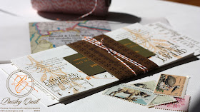

Lauren had seen Meg and Tyler's Connecticut invitations on the blog and wanted a similar look for her wedding weekend taking place in Vermont. She loved the idea of the vintage map envelopes and the mad-lib style response postcard.
Her colors are soft, gold, yellow and pink tones. It is hard to tell, but it is actually printed with gold ink and has a very subtle shimmer to it.


Wheat will be an important element in her wedding decor, so we included it in the invitation design.
They have a fun weekend of events planned leading up to the big day, so it was important that she have an itinerary.


These invitations are fabulous! They are creative, artistic and fun.
ReplyDeleteI really like the font and colors used. The orange really adds a wonderful color to the overall design.
ReplyDeleteMolly,
ReplyDeleteMichael and I can't sing your praises enough! We are so happy with how the invitations came out and how you interpreted our vision -- the end result is a perfect reflection of what we were looking for. It was a pleasure to work with you, and we will recommend you endlessly!
Lauren & Michael
Thank you Lauren!! You were great to work with as well! Thank you for giving me the opportunity to work on such a fun project!
ReplyDeleteamazing - I love the font, the layout, the colors...great job!!
ReplyDeleteWow - you are very talented! Would love to get married again just so you could design my invites!
ReplyDelete